

Unravelling the hidden ancestry of American admixed populations (Montinaro et al., 2015)
***
Own calculations based on “Unravelling the hidden ancestry of American admixed populations” (Montinaro et al., 2015)
____________________
“Although our sampling of Africans is incomplete, we see variation among groups in similarity to present-day populations from different parts of Africa. In all groups, the Yorubans from West Africa are the largest contributor, confirming this region [Lower Guinea] as the major component of African slaves” (Montinaro et al., 2015, p.3)
“In addition, more than 30% of the total slaves arriving in mainland Spanish America up to the 1630s came from Senegambia, and we accordingly find that the relative contribution from the Mandenka is higher in all areas historically under the Spanish rule.“(Montinaro et al., 2015, p.4)
____________________
***
Unravelling the hidden ancestry of American admixed populations
(Montinaro et al., 2015)
Link to online article
____________________
“We can see the huge genetic impact that the slave trade had on American populations and our data match historical records’, said study author Dr Garrett Hellenthal from the UCL Genetics Institute, ‘The majority of African Americans have ancestry similar to the Yoruba people in West Africa, confirming that most African slaves came from this region.” (Daily Mail, 24/3/2015)
“The ancestors of Yoruba people provided the largest contribution of genes from Africa to modern Americans” (Daily Mail, 24/3/2015)
____________________
This recently published study from 2015 looks really great on paper as it aims for exactly the same target as this very blog: uncovering the ethnic/regional roots of the Afro Diaspora. That’s why i’m a bit disappointed to say i still have mixed feelings about some of the main results and especially the way these are being presented. At the end of this blogpost i will discuss some of the findings i found to be worthwhile but i’ll start first with dealing with some more questionable outcomes. It is certainly a very admirable and ambitious research effort trying to “unravel” all the various ancestral components of people throughout the Americas. However when specifying the African origins of the Afro Diaspora using ambiguous phrases and imprecise terminology can be counterproductive and even irresponsible. Especially when the mass media gets involved. The quotes above being taken from the Daily Mail, a British tabloid news paper. Of course some simplifying generalization to attract the reader’s attention is to be expected. However since the tracing of the exact African origins for Afro Diasporans is already fraught with so many obstacles, one would assume such a delicate issue to be handled with a little bit more sensitivity. Avoiding anything that might result in even more confusion and people possibly being mislead…
Simply put the highlighted statements in the quotes above are incorrect, unless we apply a very broad interpretation of “Yoruba ancestry”. Reading instead ancestry from the entire Lower Guinea region (area inbetween Liberia & Cameroon), as was most likely also the original intention of the authors. In their paper they start out with saying that they aim for a “finer characterization” of African origins by not following previous studies which used “single populations as ‘consensus’ continental sources (for example, Yoruba from Nigeria for the whole of Africa)“. It is therefore regrettable that they maintained the usage of a “Yoruba” label to identify an ancestral cluster which goes far beyond any proper Yoruba ancestry in a strict sense. Especially since readers of newspapers will tend to take these terms literally!
Just to quickly illustrate the extent of “true” Yoruba ancestry across the Americas this table below should be useful. It is apparent that really only Brazil, Haiti and Cuba received a great number of Yoruba captives. (post slavery migrations of socalled Yoruba Recaptives to the Anglo Caribbean are not included).
***

Taken from “The Yoruba Diaspora in the Atlantic World” (Falola & Childs eds, 2005)
***
Below chart taken from the Slave Voyages Database also makes abundantly clear that even when using a looser interpretation the Bight of Benin, where Yorubaland is situated, did not provide the greatest number of slaves to any (broadly defined) destination within the Americas, it is rather West Central Africa which stands out in this way.
***

Trans-Atlantic Slave Trade Database (http://www.slavevoyages.org/)
***
____________________
“African individuals are divided within 33 clusters. Populations from West Africa showed a high degree of homogeneity, with all the Yoruba individuals from Nigeria forming a single cluster and the Mandenka from Senegal grouped into two. Individuals from Eastern and Southern Africa were distributed across 20 different clusters from three different regions (East Africa, South Africa and South West Africa), perhaps because of the complex demographic histories of populations from these areas” (Montinaro et al., 2015, p.2)
____________________
In the supplement of this study (see this link, page 7) a full overview of all the sample groups can be found. The African samples seem to be pretty much the same ones as used in the previously reviewed studies specifying the African American genome (Zakharia et al., 2009 & Bryc et al., 2009). Only the Herero from Namibia appear to be a new addition. I guess this highlights the pressing need for new African sampling when after six years it still boils down to these two same old proxies of Mandenka and Yoruba samples to capture West African diversity. Even more amazing then that still a true cluster galore is being created out of this limited dataset, but only involving the least relevant samplegroups from southern and eastern Africa. None of which are historically known to have been involved (in noticeable number) in the Trans Atlantic Slave Trade…Some of these ancestral clusters being based on only 1 individual sample! (see supplement, page 8). Implying great heterogeneity amongst these samples. It seems to make the whole analysis (pertaining to African specification) less robust to be frank.
When it comes to the sample groups from the Americas, by far the largest in number is the one called “African Americans B”, 2023 individuals being utilized. All the other samplegroups are much smaller in number, in between 19-75 after quality control. No further details are given so possibly there might be some regional bias whereby only a specific part of the country is represented. It is useful to compare the outcomes of the African American group B from this study with the previously discussed studies (Specifying the African origins of the African American Genome. Actually only the Mandenka and Yoruba based clusters seem directly equivalent but grouping all the remaining 30 (sic!) other African clusters together you might get an approximate cluster for “Bantu” ancestry i suppose (more details in next section). The original data can be obtained from this supplementary excel file. Despite the seemingly much increased granularity of 33 African clusters the results are actually not that drastically different from the 2009 studies. Especially Zakaria (2009) seems to come close, it’s just that for some reason this present study seems to undervalue “Mandenka” ancestry, especially compared with Tishkoff (2009). Based on historical sources you would expect a much larger Upper Guinean contribution than just 7% or 5%, so i’m pretty sure this ancestry could actually be hiding under the socalled “Yoruba” umbrella category. Once more demonstrating the misleading character of the labelling.
- Zakharia et al. (2009) : 63% “Yoruba”, 19% Mandenka, 14% “Bantu” (scaled to 100% African)
- Tishkoff et al. (2009): 45% “Bantu Niger-Kordofanian”, 22% “non-Bantu Niger -Kordofanian) (unscaled, non-African to be added)
- Montinaro et al. (2015): 69% “Yoruba”, 7% “Mandenka”, 23% Southern/Eastern clusters (scaled to 100% African)
- Montinaro et al. (2015): “49% “Yoruba”, 5% “Mandenka”, 17% Southern/Eastern clusters (unscaled, non-African to be added)
***

Unravelling the hidden ancestry of American admixed populations (Montinaro et al., 2015)
____________________
“In addition, more than 30% of the total slaves arriving in mainland Spanish America up to the 1630s came from Senegambia, and we accordingly find that the relative contribution from the Mandenka is higher in all areas historically under the Spanish rule.“(Montinaro et al., 2015, p.4)
____________________
The above finding is one of the more interesting ones from the study in my opinion. It is in agreement with previously done studies on Hispanic Caribbeans (see this blog post for an overview), but i guess the novel thing is that the Hispanic samples are now being compared with both Anglo Caribbeans and African Americans. Because the same methodology is being used you can get a better sense of ranking differences even when the percentages most likely are not reflective of the true extent of Upper Guinean origins. It is also in line with my own research, based on AncestryDNA results. See also this spread sheet and below blog pages:
- Dominican AncestryDNA results
- Latin American AncestryDNA results
- Puerto Rican AncestryDNA results
- Afro-Diaspora AncestryDNA results: A Comparison
Eventhough the above figure is very nice for visualization, i still find the added value to be limited when the exact %’s are not given at the same time. Also the deciphering of the exact clusters is made difficult for no apparent reason (i pasted the list of clusters to the right myself). I find this to be an annoyance for many DNA studies where preference is given to fancy infographics instead of providing clear information. If you look closely at the figure above you will notice that the darkred segments to the right are supposed to represent the share of both (!) Mandenka clusters. The brightpink to the right is for the Yoruba proportion. Indeed it seems that the Mandenka segments are relatively smaller for African Americans and Barbados while the Yoruba segments are clearly predominant for them. However there seems to be some discrepancies when you compare with their supplementary excel file, which has all the underlying data. Just from the looks of it the Yoruba and San segments for Peru, Mexico and Colombia A seem to be incorrectly reproduced. As stated in the study “in all groups, the Yorubans from West Africa are the largest contributor” however this is not being shown in above figure…
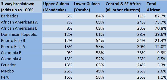
So that’s why i decided to do my own calculations based on the original data. I made one group for all of the 30 Eastern/Southern African clusters as i believe it to be more informative, plus i also renamed the Mandenka and Yoruba clusters. The result (sorted for “Upper Guinea”/”Mandenka”) can be seen below. Via this online spreadsheet you can check the calculations. We can verify that Hispanic Americans seem to have a greater share of Upper Guinean ancestry indeed. Note should be made however that especially the Mexican and Peruvian samples show very low levels of total African. Then again these minor or even trace amounts of African ancestry could also imply that they were mostly inherited from the earliest colonization period. Therefore being perfect testimony of the ethnic composition of Africans at that time.
Another very interesting finding is how Barbados is overwelmingly shown to be the most “Lower Guinean” (as measured by the “Yoruba” cluster). This is actually also confirming slave trade records which clearly show the area in between the Gold Coast and the Bight of Biafra to have been even more important for Barbados (and most other parts of the Anglo Caribbean) than for African Americans who had relatively increased contributions from both Upper Guinea and Central Africa (but with Lower Guinea still being predominant as well).
***

Own calculations based on “Unravelling the hidden ancestry of American admixed populations” (Montinaro et al., 2015)
***
p.s. The average total African ancestry given for the African American samplegroup B might not be very representative. If you enlarge the bar below you will notice many individual lines who seem to have little red-pink colouring (African clusters) but instead are blue-purple (European clusters) almost all the way. Indicative of sampling errors probably.

Unravelling the hidden ancestry of American admixed populations (Montinaro et al., 2015)
